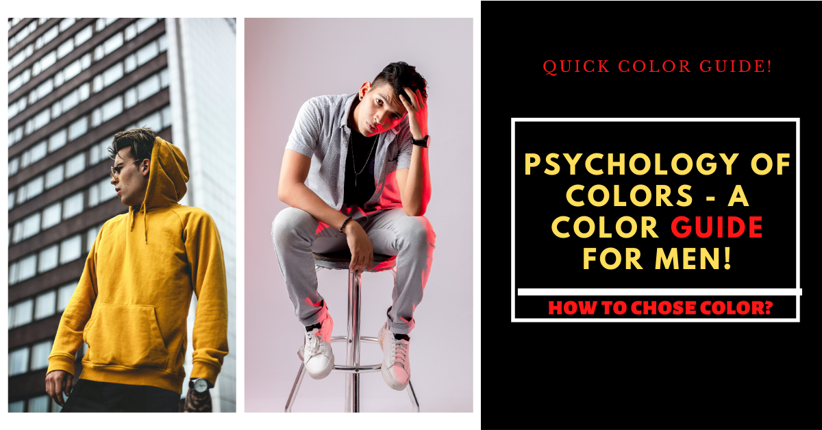
There are a handful of colors that you can wear to attract girls or to attend a party or for going in an interview. Psychology of colors that symbolize intelligence, power, social status and confidence are usually the winners and seen as most attractive to people.
Which color of clothes you can wear that perfectly fits your skin tone?
Firstly, psychology of colors should identify their your skin tone and then choose the right color of clothes accordingly so that you look impressive and attractive.
IDENTIFY YOUR SKIN TONE
Psychology of Colors starts from here. You should know about your accurate skin tone,
Follow Some Measured Steps Given Below:
STEP-1: Clean your face with soap and water and apply some moisturizer or sunscreen, and also ensure that there is no dirt on your face.
STEP-2: You grab a white piece of paper and step outside in a natural light(sunlight).
STEP-3: Ask your friend to take a picture of you or hold up a mirror and see that what color is kind of reflect on a white paper, you instantly be able to see some type of shades.
If you are start seeing olive yellow or brownish type of tone then this means you have a warm undertone skin.
If you see more pink, red or blue type of tones this means you have cool undertone skin.
And if you see more of a grayer or Ashe or a just margin between the two then you have neutral undertone skin.
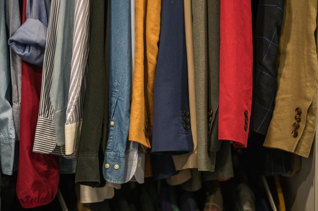
Once you have determined you skin tone then you are understanding the psychology of colors, there is some brilliant colors of clothes that you can wear to look attractive and stick to.
FOR WARM UNDERTONE SKIN:
This is entirely different to the color of your complexion which is the color of your skin and can be light , medium or dark.
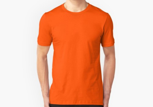
PSYCHOLOGY OF COLORS – ORANGE:
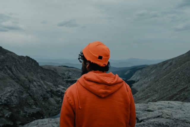
Orange is not the easiest color to wear as the color can be quite bright and overpowering.
I have seen orange in the shops in all kinds of shades from very bright to more demure colors, so you can just pick the color orange that suits your complexion and temperament best and mix and match with all these other fine colors.
GOLDEN YELLOW:
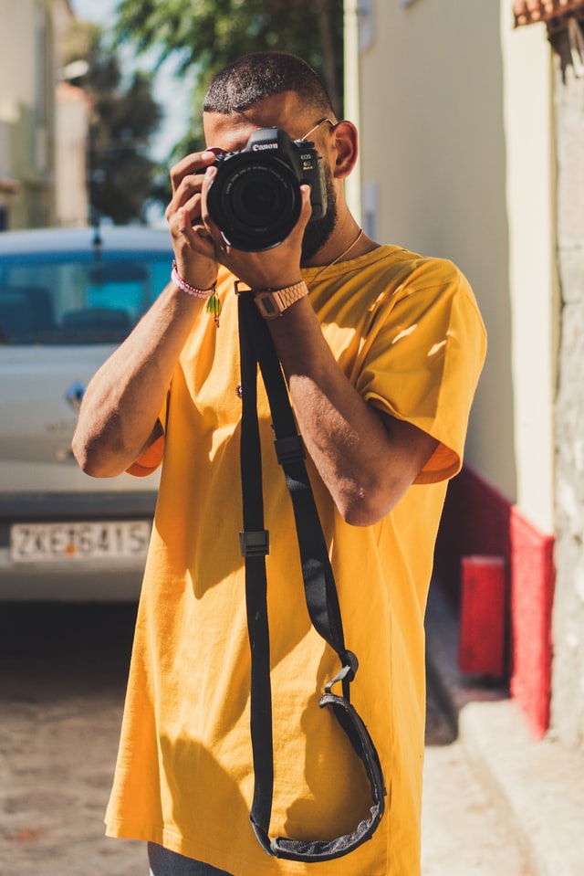
Golden Yellow remains popular as an accent color. As you may recall from my article on the psychology of color, golden yellow is associated with laughter, happiness, optimism and good times.
You may dismiss yellow immediately as a color that you cannot wear, but you don’t have to go full out in yellow to embrace the color.
I personally don’t like the color too close to my face but have still added yellow elements to my wardrobe like this golden yellow sweatshirt (below).
OLIVE GREEN:
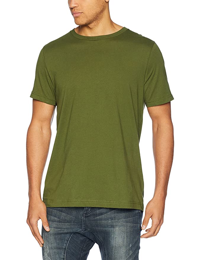
No matter which style tribe you subscribe to, there’s an olive- green outfit that will speak to you. From bold trend-forward outfits to polished classics and everything in between, we’re positive that there’s an outfit combination that will inspire you to mix the green shade into your fall outfit rotation.
RED AMBER:
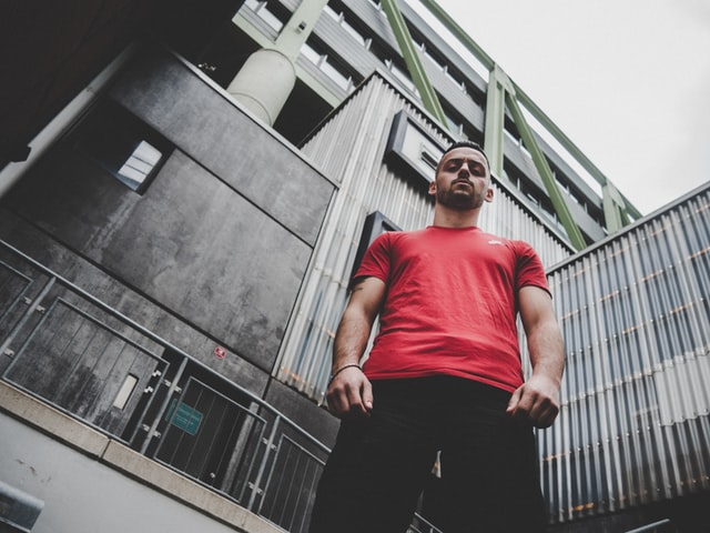
The color red is one of the boldest and most exciting shades that one can wear, which explains its unwavering popularity. Some would even consider it a neutral. (Two fun facts: The word for red also means beautiful in Russian, and seeing the color can make your heart beat faster.) But given how bold it is, figuring out the colors that go with red can be somewhat of a head-scratchier.
NAVY BLUE:
It’s one of the most universally flattering colors around and can look less harsh than black. While it’s not always in stores in great quantities all year, it looks fabulous at any time of year, whether you opt for a navy party dress at Christmas, or you wear a striped navy blue tee during summer.
FOR COOL UNDERTONE SKIN:
A cool undertone foundation will appear slightly pink in the bottle. Avoid yellowish foundations, as these tend to make cool skin tones look sallower. But don’t worry there are so many attractive colors for cool skin tone.
BURGUNDY:
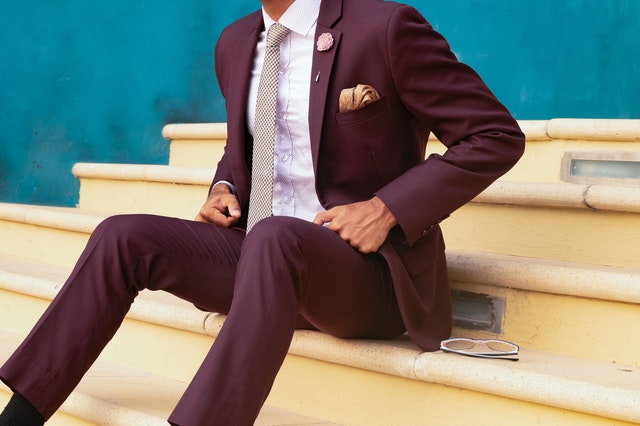
Summer colors are coming and going and before we know it, fall colors will be moving in. The number one color of fall is burgundy, a deep red color that may even look purple sometimes.A dark burgundy color can be complimentary to most neutrals (black, white, light gray, dark gray, tan, brown).
SAFFRON:
Saturated and active saffron color is relevant for different decisions, styles of clothing. It is also suitable for different situations and occasions: an office discreet set, and a light summer outfit, and a luxurious evening look. In the stylistic direction, the color of saffron fits any set. The main thing is to understand who should pay attention to such clothes, and who better to replace them with a different color.
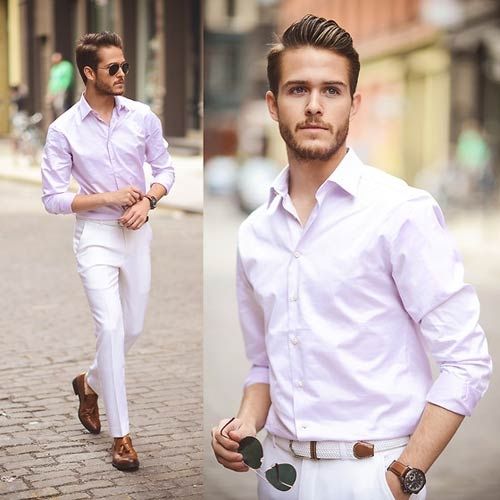
LAVENDER:
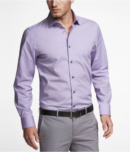
Lovely lavender. It’s feminine and spring-like and has the dewy freshness of youth. Its complementary colors depend on which lavender you are using. Every variation looks crisp and bright with white. The brighter, purple versions looks great with lime green and orange. The grayer lavenders look great with beige, magenta and yellows (gold and warm browns).
FOREST GREEN:
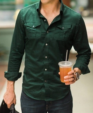
It is highly recommended to have at least one piece of clothes in this color for summer and autumn seasons. If your face is pale, then you can use forest green color for pants, shirts or small clothing pieces. It allows to catch attention when matches with bright colors like pink or neon yellow being visible from far.
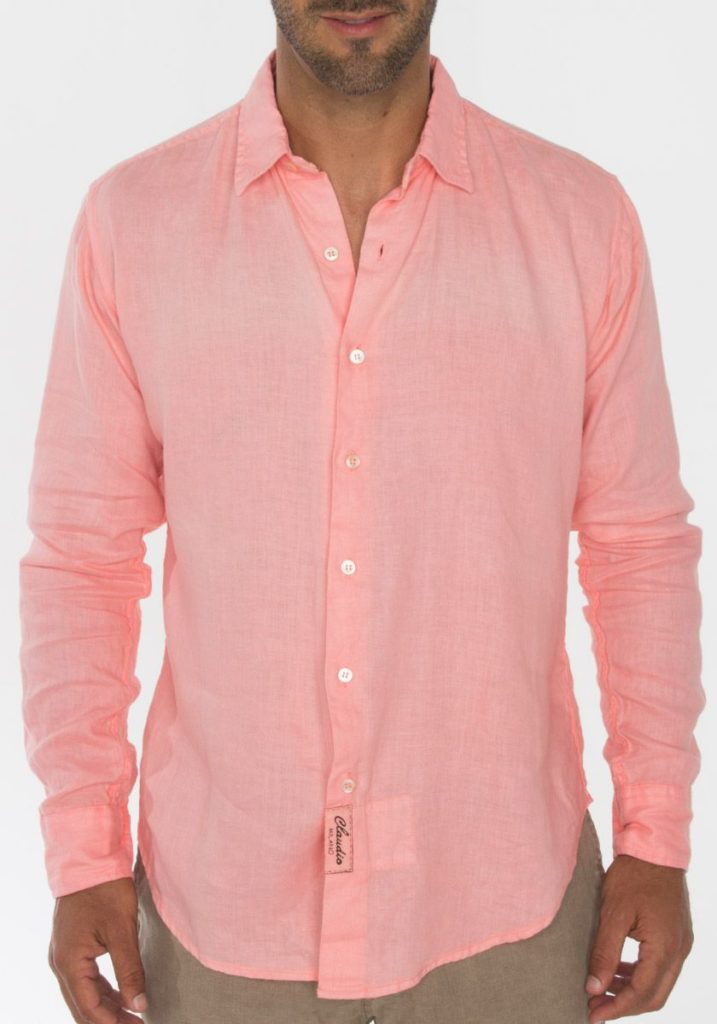
LIGHT PINK:
Pink never really goes out of style. Pink is still one of our favorite colors to wear when our wardrobe needs to be shaken up a bit. Whether you prefer bright jewel tones or soft tones. Try flaw just a hint (or a whole lot) of pink into your usual routine. We swear, it will make you feel happier!
FOR NEUTRAL UNDERTONE SKIN:
People with neutral undertones tend to look better in foundations that are neither overly yellow or pink. Instead, look for a combination of the both — a peach foundation can work well for neutral tones.
LIGHT PEACH:
Peach color in casual wear which causes sensations of warmth, comfort, goodness and joy in a person. In order to share with others his good mood, he is best suited. It combines perfectly with other colors, creating pleasing color combinations for the eyes. This color is regardless of the season and fashion trends in color clothes.
LIGHT BLUE:

Light blue is a popular, versatile color which gives a relaxed appearance. This Color can be matched with a range of colors. It looks great next to a crisp white and cozy . Light blue looks great next to hues like dusty rose, as soft pink is its complementary color on the color wheel.
OFF WHITE:
As a softer shade of white, off-white has the potential to be a part of every garment or accessory that you wear. An Off-White attire looks best when it comes to look fashionable. From head to toe in Off-White , you can find everything from sweatshirts to jeans.
The Street wear styles and urban clothing appeals especially to a younger target group. These colors will improve you personality and looks and hence you can impress people through your outlook.
I got this site from my paal who shared with me concerning this website and now
this time I am browsing this website and reading very informative articles or reviews at this place.
Wow, amazing blog layout! How long have you been blogging for?
you made bloggging look easy. The overall look of your web site iis excellent,as well as
thhe content.